Calculating Transit Passengers Volumes on Links
Requirements: Network, Events, Transit Schedule, Transit Vehicles
The tutorial Average Speeds and Volumes on Links explains how to calculate the number of vehicles on links. But for public transport, this number is often irrelevant. Rather, the number of passengers is typically of more interest. The following short tutorial explains how the number of passengers in transit vehicles on links can be calculated. This is especially useful if multiple transit lines (or even transit routes) share the same stop sequence and the total passengers count of all lines or routes serving this stop sequence is of interest.
Data preparation
- Add the network file, events file, transitSchedule and transitVehicles files to Via.
- Create the following layers:
- Network
- Agents (from Events)
- Vehicles (from Events)
- Transit Schedule
- Open the Network layer’s settings dialog.
- Select
Link Attributes, then click onAddand selectAggregate Vehicle Attributes.
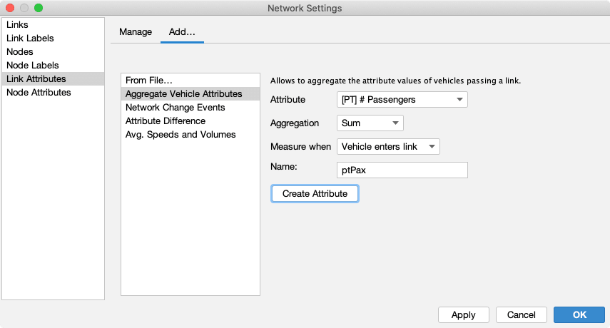
- Set the options according to the screenshot above:
- Set
Attributeto[PT] #Passengers. - Set
AggregationtoSum. - Set
Measure whentoVehicle enters link. - Give it a useful name.
- Set
- Click on
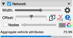
Create Attribute. A progress bar in the layer’s panel will show the progress of loading the necessary data.
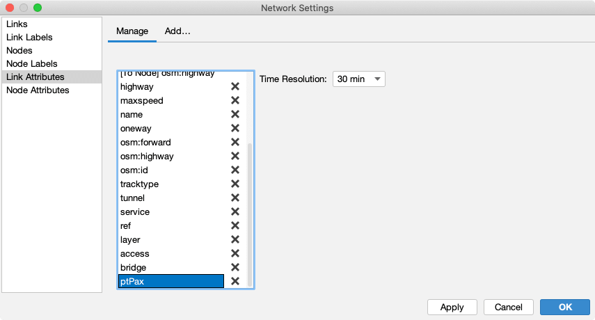
- After the attribute has been fully loaded, you can select it in the attributes list and adapt the settings if necessary. The time resolution influences over which time window the aggregation is performed.
Visualization
After the necessary attributes are created and properly configured, the network can be visualized making use of the new attribute.
- Hide the Vehicle layer, Agent layer, and the Transit Schedule layer.
- Open the Network layer’s settings dialog.
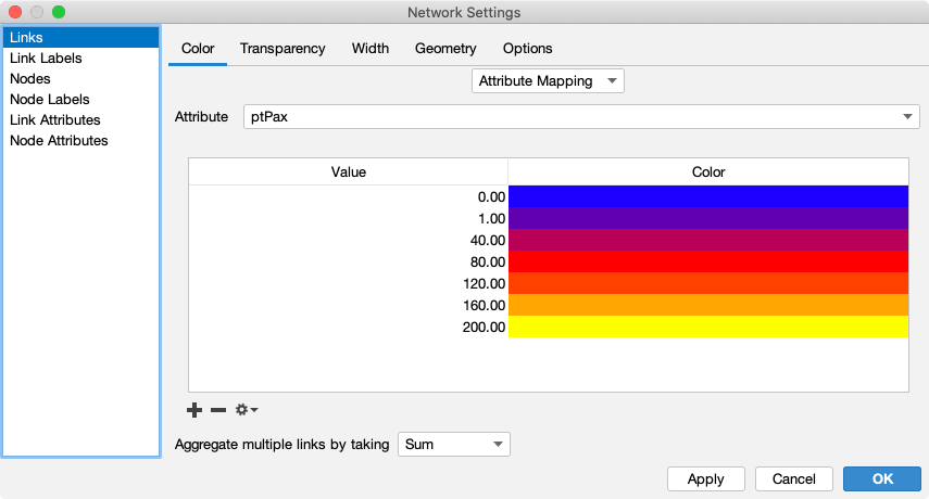
- Set the link color to type
Attribute Mappingand select the newly createptPaxattribute. - Click on the small gear icon next to the plus and minus buttons below the color table and select
Histogram. - Create a nice color ramp based on the maximum value from the Histogram.
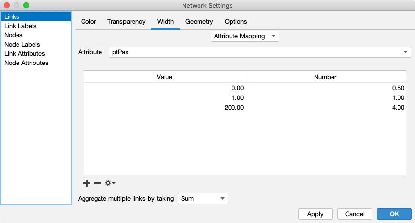
- Set the link width to type
Attribute Mappingand select theptPaxattribute. - Create a matching link-width distribution.
- Click on
OK
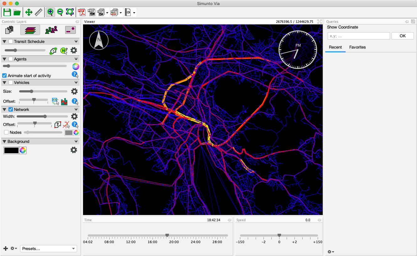
This should result in a visualization similar to the one shown below. Change the time of day and observe the different visualizations.
Visual analysis
With the settings as provided above, links where a high number of transit passengers are transported will be shown in bright yellow, while links with a lower number of passengers are red or purple. Blue links have no transit passengers at all.
Alternatives
The MATSim network contains links for private car and for transit. Thus, in the above visualizations, not only links served by public transport are visiable, but all links in the network, which can give a misleading impression.
This can be fixed by only showing links for public transportation. Typically, such links offer additional modes next to car. This allows to set the transparency of links to 0.0 (meaning fully opaque) for links that have one of the modes used by public transport, and set the transparency to 100.0 for all other links, which in that case hopefully should be the car links.
If this “filtering” with the allowed transport mode is not possible, one could just hide all links with a value of zero for ptPax. “Hiding” in this case again involves transparency, setting a fully transparent color for 0, and an opaque color for 1.